Art Deco Moderne was a big topic tonight. Illustrated posters in a style of Ludwig Hohlwien. The use of iconic 2D illustrations and bold design choices in posters. Propaganda posters from all sides in WWII are very influential for future designs. FUTURA GETS CREATED!! Herbert Matter makes incredible use of Plakatstil styles with Image & text combonations for communication.
These are some of my favorite historical posters. The styles they created with their illustrations can be seen coming out in my work with vector art. The use of micro + macro image and word combonations are essential skills used by all designers today and they are engrained into our brains here in school. The Swiss styles created during this time period are nearly perfect and helped bring graphic design away from so much illustration.
Monday, March 23, 2009
Monday, March 16, 2009
Unit 2- Lecture 3, March 16th
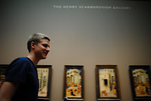
Today was a good day is History of Graphic Design. De Stijl and Bauhaus are two movements I've always been fascinated with. The use of purely vertical and horizontal in the design is fantastic and amazes me. The methods developed during the Bauhaus are what really make Graphic Design it's own medium. Type and image combinations with Modernist form and communication make for beautiful works by Herbert Bayer and Moholy Nagy. New Typography is very nice because of its use of diagonals and white space. Tschichold very important in revival of traditional typography. Dutch design is in it's own realm, they recycle ideas and use them in a new way. I love the printing arts they used. The ads and posters are so exciting and modern to this day.
A lot of the styles and techniques we saw today are very similar to todays modern design. The use of type and image is pretty much what graphic design is today. The use of random versus structure allows for designers today to create visual texture in our designs. Many of these techniques have been brought into todays motion graphics.
A lot of the styles and techniques we saw today are very similar to todays modern design. The use of type and image is pretty much what graphic design is today. The use of random versus structure allows for designers today to create visual texture in our designs. Many of these techniques have been brought into todays motion graphics.
Monday, March 2, 2009
Unit 2- Lecture 2, March 2nd
Suprematism and its form and color led to Constructivist movement. Constructivist is the word of the day. With the rise of communist Russia a new and great design movement came along with it. Rodchenko and Lissitzky bring design as we know to a whole new level of modern. The way they developed high contrast, angles, condensed typefaces, bold shapes, and photomontages created a style that many try and fail to create today. Its so strong, and brute-like when you see it, but its comfortable at the same time. They abstracted ideas, typefaces, and geometric shapes to convey ideas which was completely revolutionary and blows me away still. The establishment of the Grid in the "Isms" book might be one of the biggest things we learned today for me. The fact that they almost use entirely San Serif means they are my best friends next to the swiss.
We use the ideas and techniques these men developed pretty much everyday in our studies in the studio. The grid is something that will be around forever, and I will never stop using. The boldness and strength of these designs is something many of us try to put into our own designs to stand out from our classmates. I personally like my designs to be seen, much design today fades to the background, and the constructivist techniques make work really stand out. I will use San serif all day everyday if nobody stops me.
We use the ideas and techniques these men developed pretty much everyday in our studies in the studio. The grid is something that will be around forever, and I will never stop using. The boldness and strength of these designs is something many of us try to put into our own designs to stand out from our classmates. I personally like my designs to be seen, much design today fades to the background, and the constructivist techniques make work really stand out. I will use San serif all day everyday if nobody stops me.
Design Discourse 1
The Spectacle: A Reevaluation of the Situationist Thesis
Veronique Vienne
- creating is more satisfying than purchasing
- Situationists protest the commercial takeover of everyday life
- idea of "drifting" to defy traditional space-time
-"rerouting" to convey different ideas from images
- happiness is liberating, euphoric, mischievous, prankish.
-designers have assisted in commercial saturation of the enviroment
- Fight boredom with happiness that doesn't consist of shopping
 This image shows a Walmart opening on black Friday. Its a representation of how the Situationists felt people would mistake material goods for happiness. The joy seen on the faces shows how much people have fallen into the commercial idea of happiness. These people should be making truly thoughtful and sentimental gifts, or spending time with their loved ones during the holidays instead of running each other over for a Sony tv. Nearly all corporate companies that make products have something in Walmart, its the epitome of what the Situationists want to leave behind so we can just live lives peacefully just going with the flow.
 The image above is a graceful display of the Situationist method of rerouting. The maker took a simple caring image and with slight manipulation gave it an outlandish meaning. This is a great representation of commercialism in America. No one is safe anymore, children are raised on these ideas that shopping makes us happy. Like little girls just want to go buy dresses and what they see on tv, instead of learning from their parents or developing there own imaginations and creativity.
 This is an Adbusters poster that fits the Situationists ideals perfectly. They don’t want Americans to just go out and buy buy buy all day long. They want people to stop, sit, look, and live life happily without having to hold a product or read an advertisement. Although its kind of ironic because this is sort of an advertisment, but its intent is reversed. The poster is for "Buy Nothing Day" by Adbusters. The Situationists felt if everyone in America didn't purchase corporate products, for just one day, and went to the park, or conversed with family, or just sat down they would have more fun than holding a product.
Subscribe to:
Posts (Atom)